Collage
The process of ruining a perfectly good National Geographic and Tate magazine
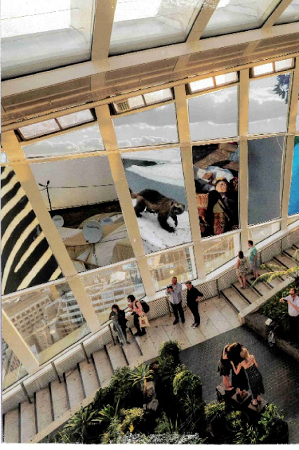
I didn't really have a set theme when i began collaging and, at first, I thought this was an issue. It actually turned out to be more of a blessing because I just let myself be inspired through the process and the act of simply cutting and sticking. I found a rather old national geographic magazine that I decided I would take a look at. There was a wide range of material that caught my eye. I tried to use as much of the magazine as possible and take out images that I maybe wasn't even convinced by to see what I could do with them anyway. I didn't want to put together photos or textures that made sense- I wanted to create a completely different meaning. I cut out images ranging from animals, environments and situations and put them on a pile to the side. I carried onto flick through the magazine until I found an image that I could incorporate these photographs into. I then came across the one above- a very formalised, wealthy building with appealing wide windows overlooking the city. Having come across images that completely juxtaposed this environment, i decided to incorporate those to give this picture a new, more meaningful image. The meaning I came out with through doing this was that people in ideal living situations are becoming oblivious to the problems that other areas of the world are facing. This includes climate change, war, famine, drought etc... The people in this photo are looking out the windows across a rich city, not realising the unresolved issues that lie around them. I quite like the people in the corner taking a photo because it reinforces the idea of social media and that despite the media coverage of these issues, people still flick past them like it's none of their business. They become even more oblivious the more they are faced with it.
I have a few old maps that, if you attempted to follow them, would probably end you up in the middle of nowhere. So, I decided to use the idea of taking one place and contrasting it completely with another. I took an extract from the map and found a juxtaposing environment to stick with it, creating an even stronger sense of being lost. I layered about three different environments with similar textures and colour palettes over one another as if your eye is being taken on a journey like following a map.
 In the image (above) with the yellow stripe running through it, I added the characters. Before it was simply an abstract painting with no figures. By adding the people, a whole new dimension was created- we'll call these people 'the yellow people'. The yellow people give the image a direction, like a story is about to unfold. It also has no sense of space or time, as the painting itself is abstracted and the characters are each on different levels of this 2 dimensional world. There are no objects that resemble familiar things so it creates a rather alienated space. I really liked how this turned out and how simple it was to create so i tried to create a similar idea over another image (the one below). I extracted characters and the little house from the same drawing i took the 'yellow people' from to attempt to create some kind of theme. The taller red characters were already in the image. I added the smaller people and the house. I love how the colour scheme matches almost perfectly, as if this image was meant to be created in this way. I also like how each character has a similar texture, as they've been painted in similar ways.


Comments
Post a Comment